A blog about a coptic bound journal, but it's really about how voyeurism derails an illustration practice

Recently I had cause to revisit this journal I created as an illustration student in 2015.

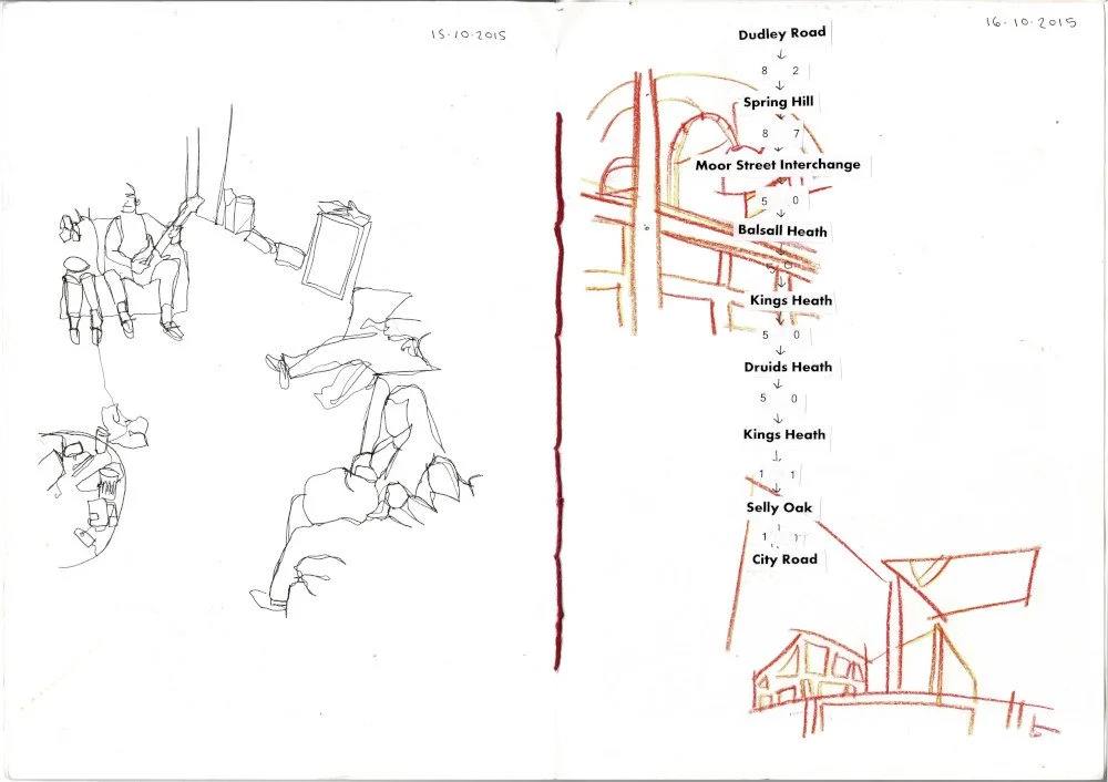
To create this book, I used A4 150gsm paper. The size of the book is A5 and it is bound using the coptic binding method.

Bookbinding was a key focus of the module I created this journal for, so I elected to make the binding as visible as possible. I selected a red thread to tie in with the wider colour scheme of the book – although the stylistic decisions seemed haphazard, they leaned in certain directions and the binding of the book was key to framing this. I did not attach a cover to obscure the binding.

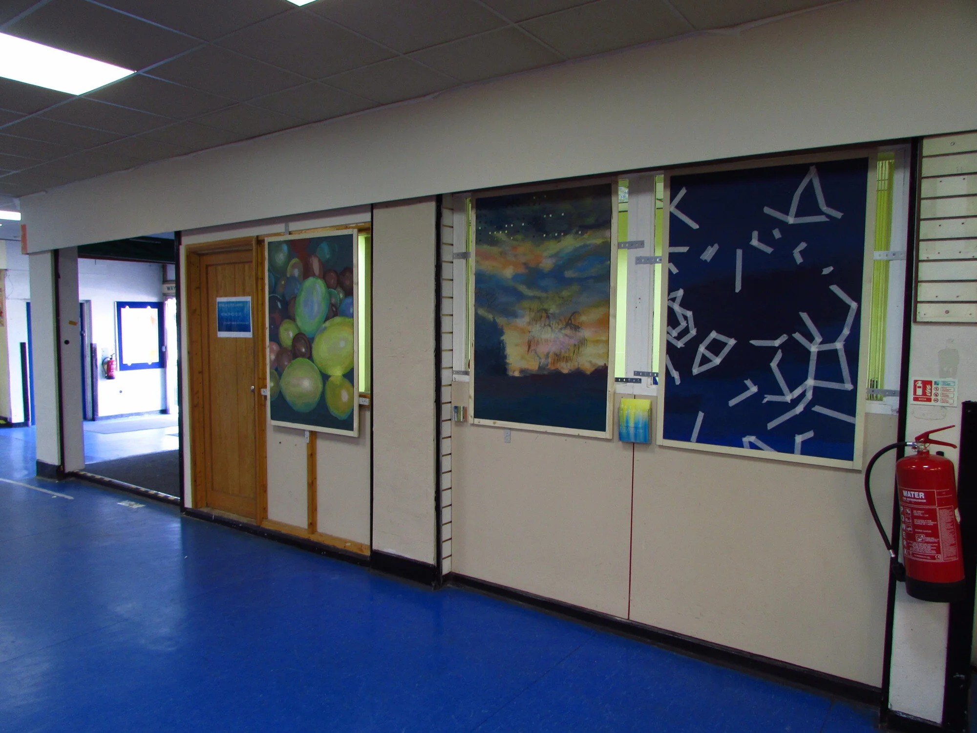
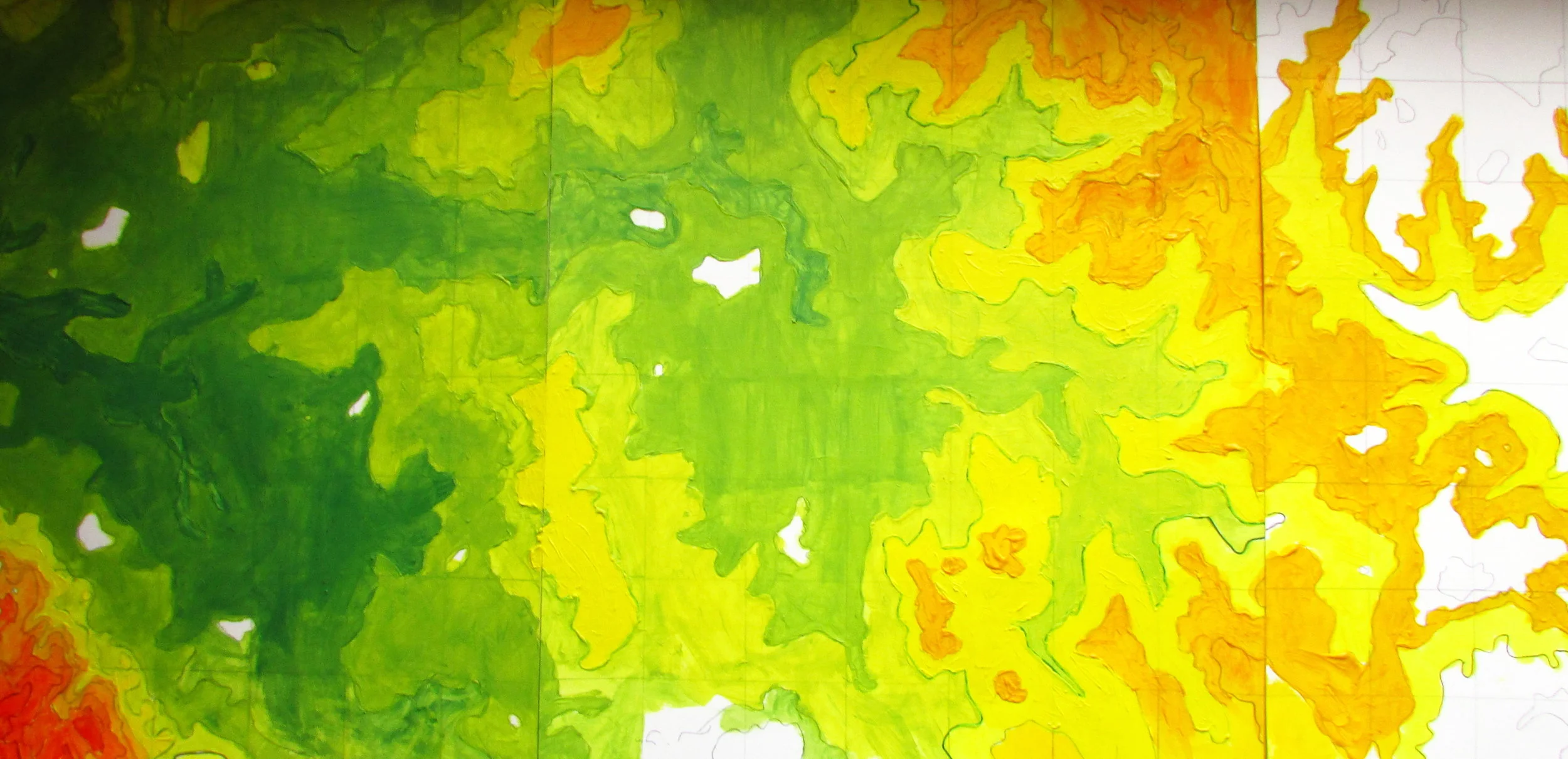
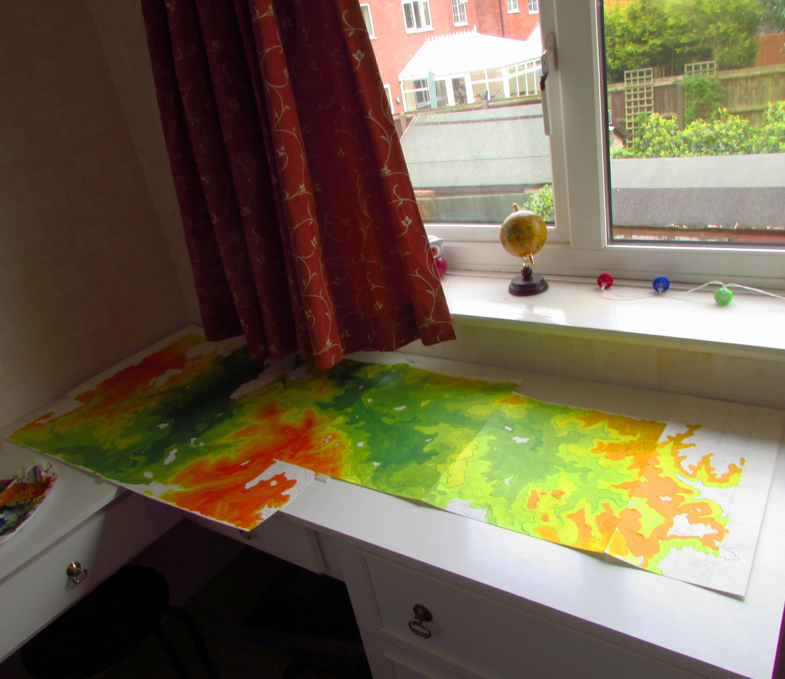
Beyond these technical aspects, the creation of the book relied on collage, with a collection of papers and pigments. Illustration naturally plays a key role, but photography, text, and found items are interwoven with this.

The book is now 8 years old, and already some pages fair better than others. Throughout my art career I have worked with a lot of unstable and destructive materials, but interestingly their appearance in this journal is moderated, and usefully the worst are mostly restricted to specific spreads.

The main issue over the longer term is the reliance on digitally printed material, which accounts for a good portion of the material in the book. Due to using the methodology of collage, these came into the project as second-hand materials rather than created specifically with artistic intention, and are likely to be dye ink on acidic paper.

Journals, sketchbooks, diaries etc are a difficult subject. It is often difficult for the author to determine what their function is supposed to be. I am motivated in the moment by self expression and a desire to vent, only to find this is contraindicative with a desire to leave a record to be read over at a later date, which requires an acknowledgement of an audience and the editing and self-moderation that comes with it.

What is interesting about this journal is that it’s the last series of records about my life I created before I became a stalking victim, which was an experience that had profound and lasting effects on my judgement calls when recording or drawing attention to what I pay attention to day to day.

These pages are dated 2015; it was 2021, six years later, when I finally came to terms with the lasting impact this experience was having on my ability to create art. My practice felt hollow as I continually disengaged from what had originally been its core driving force - a wish to earnestly communicate my internal experiences with an external audience. I desperately sought privacy wherever I could find it. I didn’t want the audience. I was trapped in a stalemate.

The motivation behind my practice had to shift, and I became more interested in the materials I was using. I explored ideas of tradition, longevity, and quality, leading me primarily into an oil painting practice but also supporting my ability to produce prints.

Focusing on the materials was a sincere activity while simultaneously being a diversion tactic. It took the pressure off the image and what I was attempting to communicate, allowing me the space to construct an image that did not have much to say. Alternatively, it allowed me to create an image like normal and distract the viewer away from any observations I did not want to handle, by discussing the physical components rather than the visual effect.

With the pressure to leave myself exposed to an audience gone, I could shut down and restart being an artist from scratch. Eventually the desire to record and communicate naturally developed, the same as it had the first time around.

Creating another journal like this, as in physically creating and binding it myself, is my route back to where I was in 2015. I can focus on the materials and technical elements, forming a sense of community with all the people over hundreds of years who have performed the same craft. The contents of the journal are in addition to the physical construction of the journal itself, rather than having to do the heavy lifting on their own.

For all the talk of having an audience and being seen, what I like about the 2015 journal is that it doesn’t need one. This book feels comfortable tucked away in a box in a storage unit where the contents of a generic sketchbook need a further purpose.

2022 Artsite3 Posters

Artsite3 studios is an industrial unit full of art studios based in Hereford. At the moment, this is where Damhán Alla Art is based. Recently, I have been designing posters for Artsite3’s monthly open studios, which coincide with Hereford First Fridays.

To begin with, my designs explored the physical location and layout of the Artsite3 building. The February and May posters explore the small industrial estate Artsite3 is in (Rockfield Road Industrial Estate), acting almost as a map or directional guide for unsure visitors. March and April reveal information about inside the building.

Having established a degree of familiarity, June and July move into exploring colour and texture. Artsite3 is strongly associated with this sort of cadmium yellow colour, and when I saw Millie Morgan’s photo I just knew I had to have it for a poster. This also coincided with us opening applications for the 2022 Artsite3 Award, which Millie had won in 2021, so it was helpful to use her imagery and draw a subtle link.

July sees the use of chipboard as a background and now adding shapes that are familiar with Artsite’s brand - these sort of strips of colour with text. The August open studio is another iteration of this, this time featuring a wonky and over exposed photo of a wooden wall with gaps in. This was utilizing connotations of uncomfortably hot weather, as by August the heatwaves had left their mark on the psyche of the local community in Hereford.

October and November move back into being more illustrative, with October using a mixed media approach, again back focused on the architecture of the Artsite3 building. November contained more basic imagery due to the larger amount of information that needed to go on the poster. It also acted as a signifier of the tone of the open studios, which became more informal and chaotic into the holiday season.

The September and December First Friday posters were designed by different artists.

Marketing tactics varied month by month, and some of the posters were produced in a way that allowed for infinite expansion, or easy cropping.

The open studios will be continuing into 2023, on the first Friday of every month between 3-6pm. If you want to find out more about these posters, or just have a look at the studio I designed them in, come and visit!

Hopstilt: Hidden Gems / Inside Out

In 2020 I worked on a project with Hereford Museums Service and the staff at Hereford Garden Centre called ‘Inside Out’, which aimed to get art about objects in the museum stores into unusual venues.

Originally my involvement with the project was to run from Jan-May but due to the pandemic it went on a lot longer, with the nature of the project changing considerably as we adapted to the situation. I was one of three artists chosen by the Museum Service, and we were all given different groups of people to work with, who picked different objects of interest. I worked with my group to develop three digital photo-collages of the object that could be projected onto/within the venue.

To begin with, I met two people from the garden centre at the museum stores where they picked out a shortlist of objects. Eventually they decided to go with the hopstilt, which was a piece of equipment used by seasonal farm workers around the beginning of the 20th century to stand on and pick hops. The agricultural nature of the object worked well with the venue (the garden centre) and our interests as a group.

As lockdown came and went and summer came along I had done some research. This archive of hop-picking images from Derek Evans was an incredibly helpful resource, and so much of my project built on other research previously done in the region.

After watching Stories from the Hopyard I realised I was particularly excited by how the seasonal workers would travel in by train to Ledbury for the season. A lot of these workers were from Gloucester, the black country (a region of towns/cities near Birmingham) and/or travellers.

To get some source images to create the digital collage I went to Ledbury. I took photos from the disused trainline that is now a public footpath, the seasonal flora/fauna which would be relevant to the time of year the farm workers were in the town, some of the local masonary on the older structures. Finally, on my train journey home, I took some photos of the hop-fields as they currently were. I used these images to digitally construct the hop-stilt collages.

We installed the artwork on the run up to the Christmas period. After its initial placement the garden centre group moved it to a different location in the building. It was really interesting to see it in a completely different context. After over 6 months in the garden centre it has returned to storage in the museum stores until it moves to its next location.

Art Exhibition @ Wilton Market

In 2019 I created a series of artworks focused on a specific location and time with the aim of universalising it and making it non-specific at the point the public engaged with it. Essentially I was playing with the concept of comic abstraction.

The location/time was premodinently focused on a student house I lived in on Venns Lane in Hereford between October 2015-Janurary 2016, with some tangents that explored the tiny little world it seemed to be the centre of. It was a really odd house on the outskirts of Hereford and also a really odd time in my life. All of the buildings in the vacinity had completely different architecture styles, and due to the geography there were lots of these sunsets that sort of leave you feeling like you’re in a dome. It felt like an environment (and a small community of people) that had been designed for a cartoon or indie game rather than something that had just organically developed in real life.

The drive to make it non-specific was two-fold, one for the sake of my privacy and also to make it more ‘relatable’. I was inspired by my personal experiences but like any personal experience, there are generic themes in there.

nuala hussey tree sky low res.JPG

I chose to exhibit the work in Wilton Market in Erdington as it is the complete opposite of the location explored in the art, and yet by being so different it almost loops back around into feeling eerily similar.

On a personal level, Erdington is my hometown. I grew up there with an understanding of all things rural being ‘somewhere else’ in a generic non-specific way. The definition of rural/somewhere else to a child growing up 3 miles from Birmingham city centre is wildly different from the version of rural I have now I am an adult who has lived in more sparsely populated regions. As far as I’m concerned as a Brummie, Hereford City is ‘rural’, the edge of Hereford city even more so. But having spent a large portion of my life now living in Hereford, ‘rural’ is somewhere a lot more remote.

IMG_7397.JPG

Hand-held plasma cutting

I've been super busy lately juggling various illustration projects and my job in an arts centre, but did manage to clear a day to spend some more time at Hereford Make! I've been looking forward to getting back there to work on some marketing material and get an induction to the onsite hand-held plasma cutter.

IMG_6801.JPG

Before I used the machinery, I had to put on some overalls, because my clothes were made of flammable manmade fibres. I also had to put on some ear defenders, and safety goggles to protect me from the intense light the plasma arc emmits. We positioned the extrator above and slightly behind the steel, to encourage the flow of air away from me as the fumes produced were extracted from the room.

pumkin spice.png

James showed me how to use the machine and gave me a couple of pieces of scrap steel to practice with. At first I pressed too hard into the steel which caused the plasma cutter to get lodged in the steel. Once I realised the trick was to not push it into the metal but instead guide it across the top, I was able to make longer lines. I was also super anxious to begin with because it was all so loud, and this showed in my mark making, because I was drawing too quickly. James told me to go slower to get the clean cut through the steel. This achieved that desired effect, and going slower also gave me more control over the lines.

I'm really happy with what I managed to produce in such a short space of time. I'm looking forward to going back and creating a bigger illustration with these new skills. What really interests me is that although I've created many continuous line illustrations in the past, these ones also have to have continuous uninterupted space flowing through them to keep them structurally sound.

Wedding Signs

If you follow me on Instagram, you'll have been seeing lots of hand-lettered signs and phrases over the past week that I designed for a wedding. I have done typography projects before, most notably the signage for Longbridge Public Art Project's Unit, but this is the first wedding I worked on!

Megan gave me some phrases she wanted with example signs that she had been inspired by. She wanted them A4 size to be put in frames, and in a couple of cases she wanted particular illustrations on them. Apart from that, she gave me control over the rest of it.

This brief really called for a variety of pens, and the most irreplacable ones were the Gold Letraset Metallic Marker and my white gel pen. Most of the pens I used came from my collection of Promarkers & Aquamarkers and Faber-Castell Grip Colour Markers. I found that system3 Acyrlic Paper was great for this project, as it had the right gsm (thickness) and a nice texture that helped the signs fit with the style of the rest of the wedding.

The venue of the wedding was a cute barn on large rural grounds, and I let the research I did into the site influence my designs. I handed them back to Megan the week before the wedding and I was delighted to see them framed and presented at the wedding.

You can read more about Megan’s wedding at Love My Dress

Hereford Make

I spent this last Bank Holiday Monday afternoon visiting Hereford Make, which is a creative hub in the Whitecross area of Hereford for artists and makers. I'd heard a fair bit about the place, but it's only now I've finished my degree that I've had the time to go and visit.

IMG_20170831_0001.jpg

It was great to see the kind of workshops and environment a lot of my friends work in. Although I've been in 3D, ceramic and glass workshops before, I'd not been in a forge. The studio space and communal area upstairs would feel familiar to most artists and designers, and I was intrigued to see that despite the boundaries between different craft and design disciplines, there's a lot of similarities in some of the ways we work.

Untitled.jpg

After James Baker took me on a tour around the site, we had a long chat. Obviously I had tons of questions for him, but he also had some for me too! Last summer, I was a summer school student and volunteer invigilator at Longbridge Public Arts Project, and that autumn my case study about my experience there was published by the Association of Colleges. It is interesting visiting different art spaces and seeing the similarities and differences between them.

21083617_1700970803332498_7141278492897018204_o.jpg

I also had the opportunity to see these great pieces of artwork during my visit! This is a good example of how the space is used to reach broad demographics of people. I'm looking forward to seeing some more amazing artwork here over the next few months.

New Designers

After the Summer Show exhibition, about ten of us from the BA(Hons) Illustration course, joined by two from graphic design took a concentrated version of our show to New Designers, a fair for arts graduates in London.

On the run up to New Designers, I wrote a guest blog for them about my creative practice. I've been published before, by the Association of Colleges and the student magazine Artboard, but this was a new context for me. It was exciting to have the opportunity to write in a new context!

I also coordinated the HCA @ ND Part 2 Takeover on the Hereford College of Arts Student Union Instagram account. Incoming media officer Tori Oliver had been overseeing the various New Designers and Free Range takeovers this summer, so I had all the help I needed. It was great to highlight some very high quality design work that was under-represented elsewhere.

When I finally got chance to look around the rest of New Designers, I met some really cool people at the other stalls! As with the HCA Summer Show, it was great to see how well everyone spoke about their work. I'm looking forward to having the spare time to have a closer look online at all the great projects I saw once I decompress. Finally, when I returned home to Hereford a week or so later I found an email from someone who'd been looking at my work at the stall and wanted to invite me to another exhibition, which I'm quite excited about!

My advice would be if you're thinking of going to exhibit, go as a visitor the year before (or if you couldn't do that and you're exhibiting in Part 2, visit Part 1, which is on the week before). If you know someone exhibiting there you might be able to get a discount code for your ticket off them, so it's worth asking around!

Travel Journal Map Illustration

As part of the travel journal project I created a decorative but accurate topographical map that included the areas around and between Hinkley and Erdington.

I had a bit of a play while I figured out how I was actually going to do the illustration. I have learnt to be on the ball and plan complicated and detailed projects like this well because any mistake I make early on will be magnified as the project went on.

The area crosses two ordnance survey maps. I defined what exactly I was going to cover in my own map. I magnified the ordnance survey maps 200% to study the contour lines and used a lightbox to transfer this information onto my paper. For each A3 sheet I traced the 50m/100m/150m lines first and went over them in pen, filling in the rest of the lines with pencil afterwards. This helped make it more manageable and meant I could keep track of what their values were quite late into the project. The lines were easier to follow through rural areas than built up areas.

I didn't actually do all this before I started painting. I was finding it too difficult to keep track of the lines. I started painting to turn the all the lines into shapes instead, because the shapes work a lot differently and behave differently with each other, so it was easier to see what was going on and make them more difficult connections.

I had the opportunity to work on this from a tiny house in Hinckley, which obviously I took.

I learnt a lot about paint mixing while doing this illustration - I only used lemon yellow, cadmium yellow, cadmium red, ultramarine (blue) and the tiniest bit of crimson red to get the entire spectrum of colours I used. I never mixed more than two colours together, and I also didn’t engage in any mischief layering different colours on top of each other. I did learn a lot about how the amount of layers alter the colour even when the background is white, and how many layers are needed to completely hide what lies underneath! Consistency in my approach was really important for this illustration, so when I bought more paint and the woman in the shop told me about the extra thick super pigment version of the paint I was currently using, it sounded interesting for future reference but I didn't want to confuse myself by applying it halfway through this illustration.

The map was then transferred into digital format so I could reproduce it as a book cover for my travel journal. It's done what I wanted it to do for now, but I'd like to do a lot more work to it. It's very time consuming because of the size and the basic lessons I am learning - it will be a lot easier for me to do this again.

I went on to cut it into smaller pieces and adding road detailing to create tiny maps. I quite enjoyed these and would like to do more.


Yoga Illustrations

While we had meetings with Pete and Corri about the Wye Valley yoga project, they would quite often bring up illustrations done by their colleagues in the yoga community.  Yoga teaching is a very visual practice, and teachers use their own illustrations to visually communicate as well as eloquently talking about the illustrations of other practitioners. For example, here is the range of illustration – through from pure diagram to a more aesthetically lead design – that can be found over at the wyevalleyyoga Instagram account.

Bobby Clenell studies illustration before going on to be a professional animator, later discovering yoga in 1973. What he learnt through yoga influenced his animation as he transitioned over to teaching at the Iyengar institute. After this ‘transition’, his drawing influenced his teaching style and the way he communicates with his students/audience. I find this multi-disciplinary approach across industries really interesting, because there can be a tension between how we perceive an ‘artist’ in comparison with other small business people, despite the similarities.

What I have picked up is that in the yoga community, the model for the illustration is important. Most illustrations are recognizable as the people they are of. When I asked Corri and Pete about their poses from the photos, they said it was more important to be true to how they actually looked than it was to be purist about what they were supposed to look like.

5.png

Bobby’s illustrations are very clear and easy to understand in the context of contemporary culture. He achieves depth despite the lack of tonal range. Foreshortening is a challenge with illustrating yoga poses, and overcoming this was what attracted me to the brief. I did experiment with just using block tone, but I felt like this held back my personal illustration style.

Here, Bobby uses arrows to signify movement on a static image. However, what interests me is the detail in the feet. This attention to detail is important in yoga practice, but I found it difficult to emphasise when illustrating full poses, not only the importance of it but also the specificities of what’s going on.